Your Place At The Table
When you have a laser cutter at your disposal, you use it, goddammit. It’s probably a bit of a cliche for our friends and family now- “Yep, Kasia and Nick did something with the laser cutter again”- but whatevs. You probably would do the same. Because laser cutters are cool.
Regular readers may or may not know that I make some pithy little cake toppers for all your birthday and basic b**** needs, so I’m no stranger to laser cut letterform products. I, therefore, decided to make calligraphy-inspired wood place cards for our table settings. It’s pretty easy, actually, if you have access to a laser cutter.*
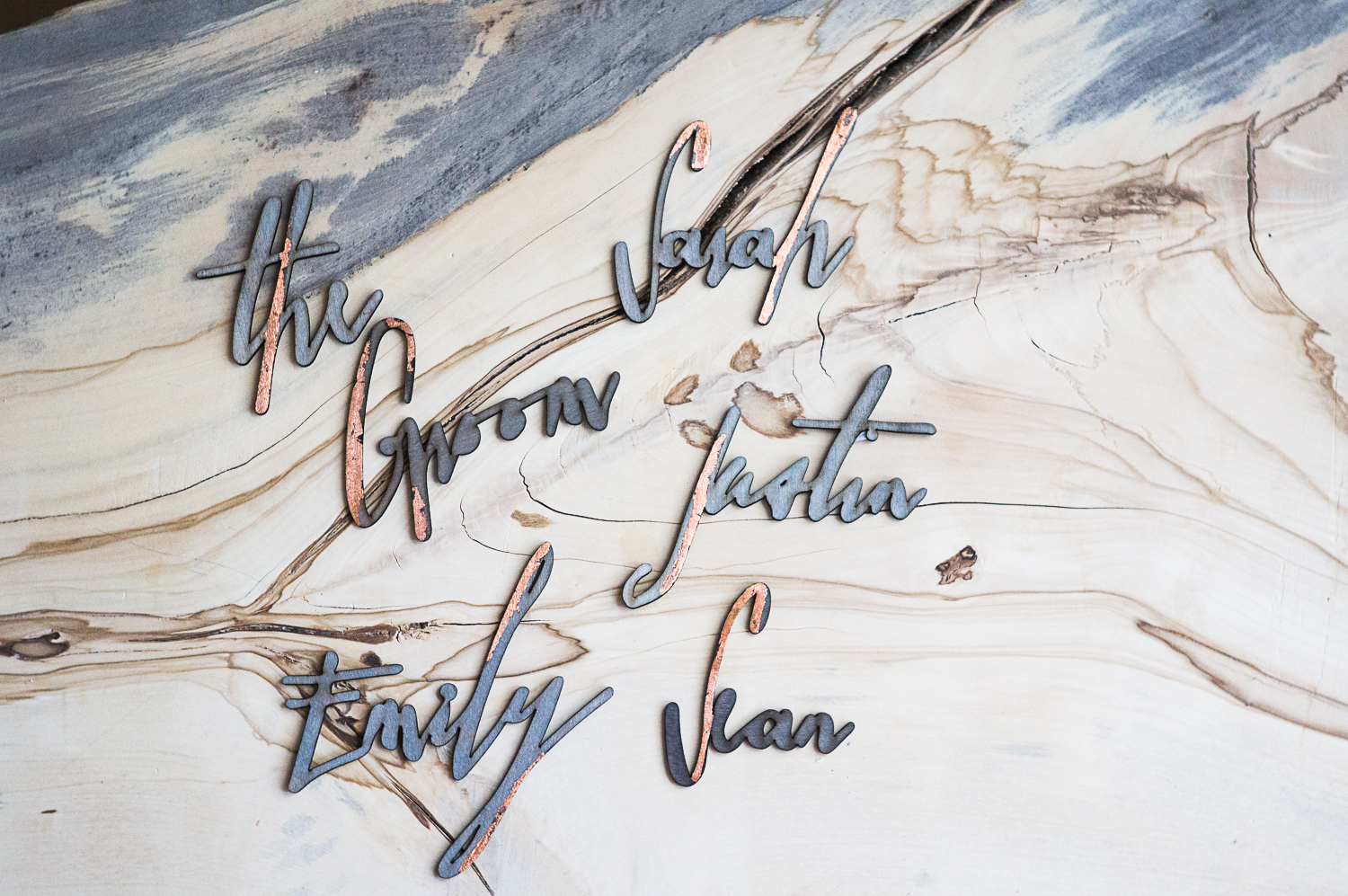
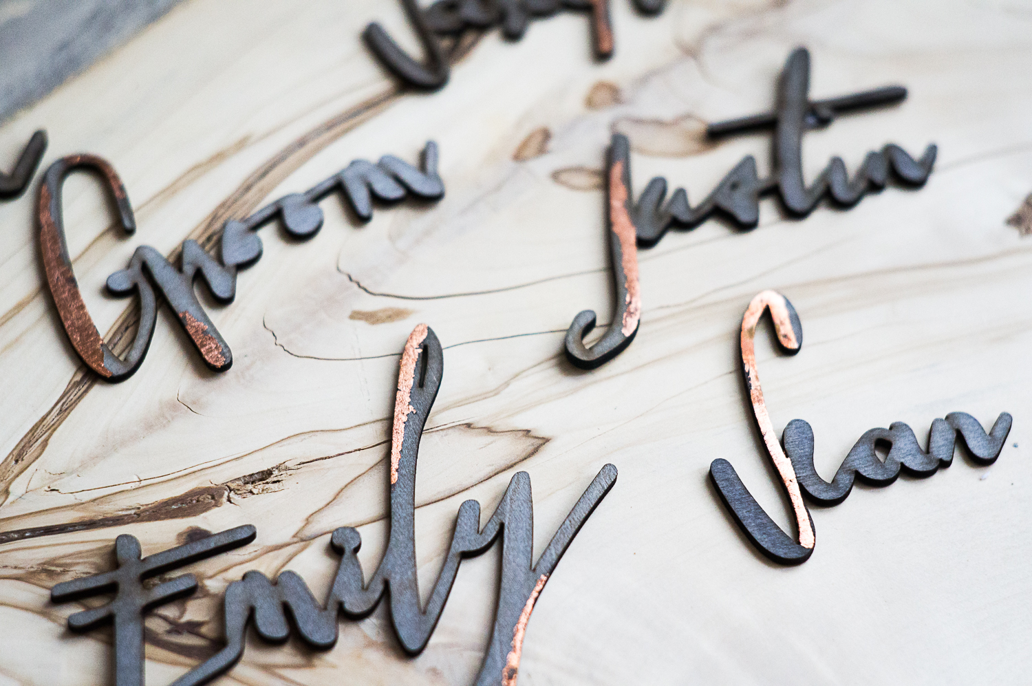
A few of the names that got left behind at the end of the night. These people didn’t appropriately cherish every single little detail of the wedding by taking them all home and displaying them in a place of honor and are, therefore, dead to me.
Now, I’ve been asked if I did the calligraphy for these- and the answer is a resounding “Ain’t nobody got time for that.” Well, actually, some people do have time for that, and luckily, they are kind enough to create beautiful fonts for us lazy, pen-challenged girls and boys to use. A Google search for calligraphic or hand-drawn fonts will result in more options than you can possible imagine, but I’m a particular fan of Magpie Paper Works and Great Lakes Lettering. Both companies create beautiful, modern typefaces that really elevate any project you can dream up. They don’t come cheap, but can you really put a price on a stellar font?
Well, the answer is yes, and it’s, like, $75.
Worth it, in my opinion- one can only use Comic Sans and Papyrus so many times- but not everyone will agree. There are lots of great free fonts out there, too- so find one you like, and get to it.
Read on for an in-depth tutorial on how to make the artwork for laser-cut placecards.
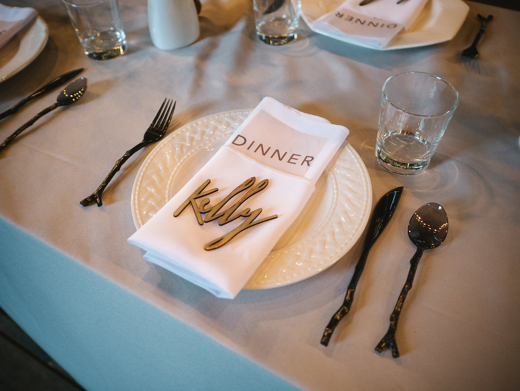 A place card in its natural habitat. (Photo 5 West Studios)
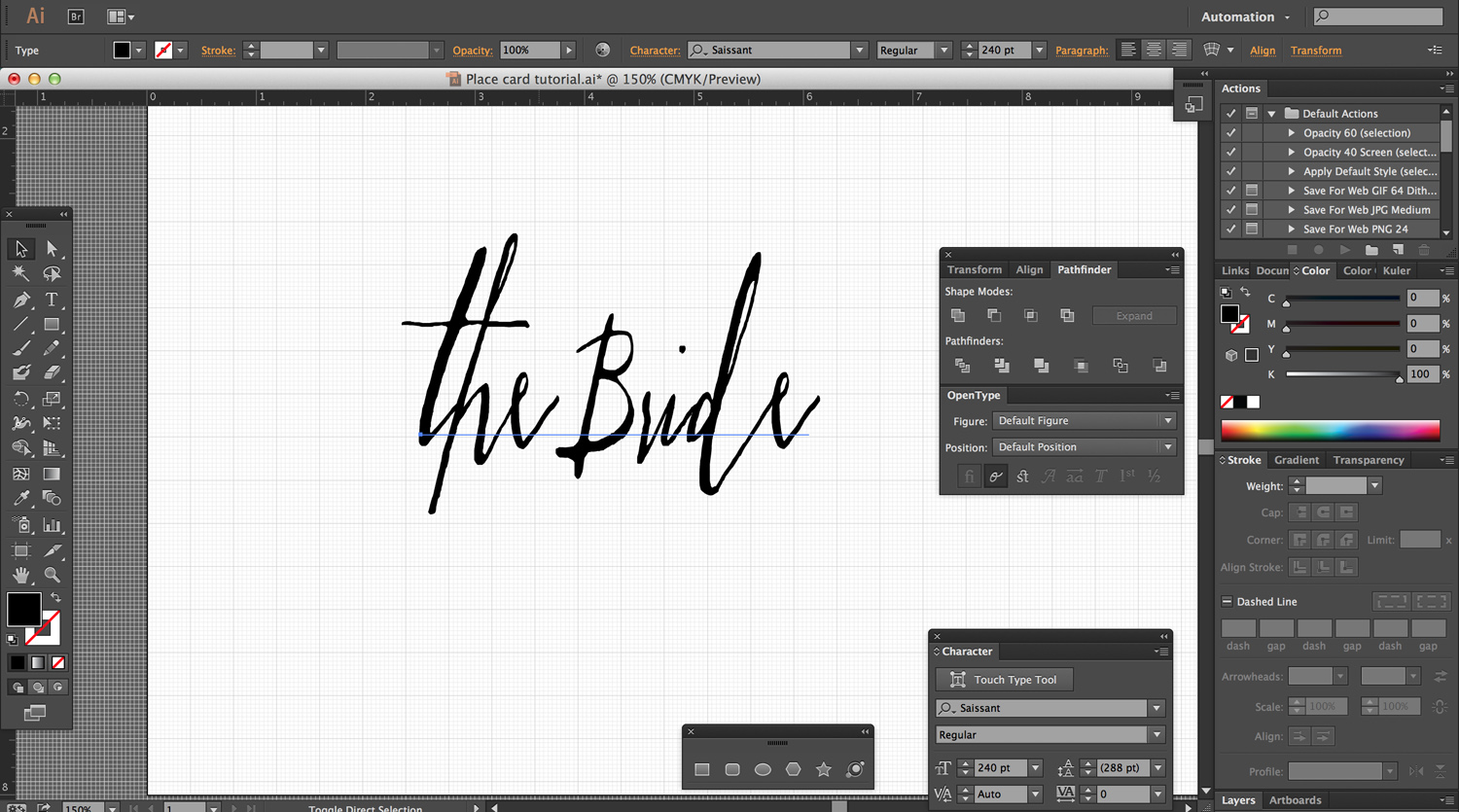
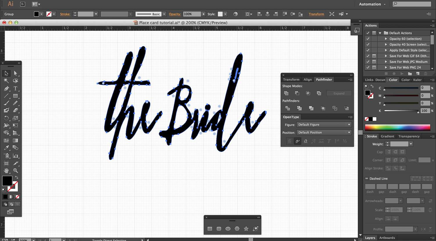
1. Choose a font and write your text. I use Illustrator for almost all my vector artwork- and it’s particularly well-suited for type-based projects. I like to work in as close to real scale as possible, so I wrote my text in 250pt font, in the beautiful Saissant typeface by Magpie Paper Works.
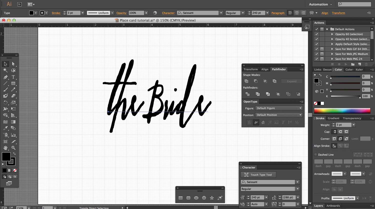
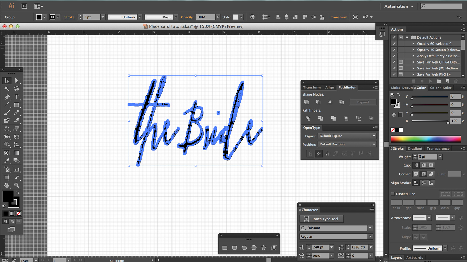
2. Increase your line weight. As beautiful as all the little wispy details of these calligraphy fonts are, they just don’t make for a laser-cuttable item- in the best case, they would break off during use; worst case, they’d burn up in the laser cutter. The easiest way around this is just to increase the stroke weight of the item. I increased my stroke to 3pts- this beefed up the connections but still left the text readable. Make sure that when you increase your stroke, you select the “round join” corner option- otherwise, you’ll end up with all sorts of spiky, weird joints.
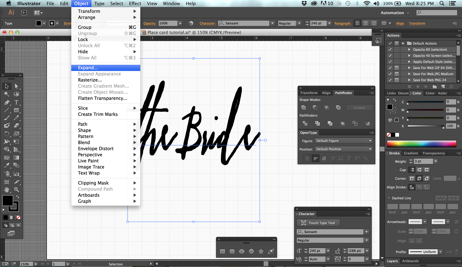
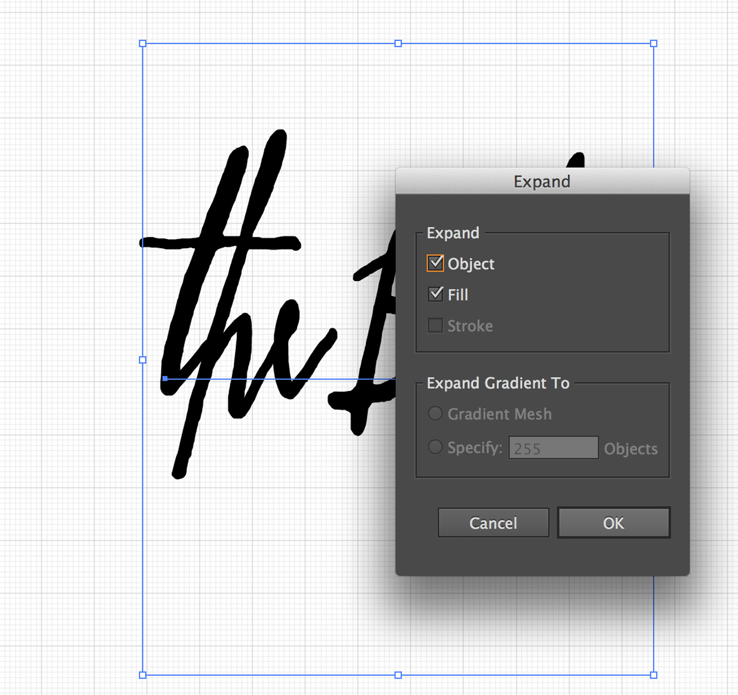
3. Expand text- twice. This converts the font and stroke into paths. Once you expand, you won’t be able to edit your text anymore, so check your spelling before this step. The first time you expand will expand just the typeface- to convert the stroke into a path, you’ll need to expand a second time. See?
 First Expansion. Stroke has NOT been expanded.
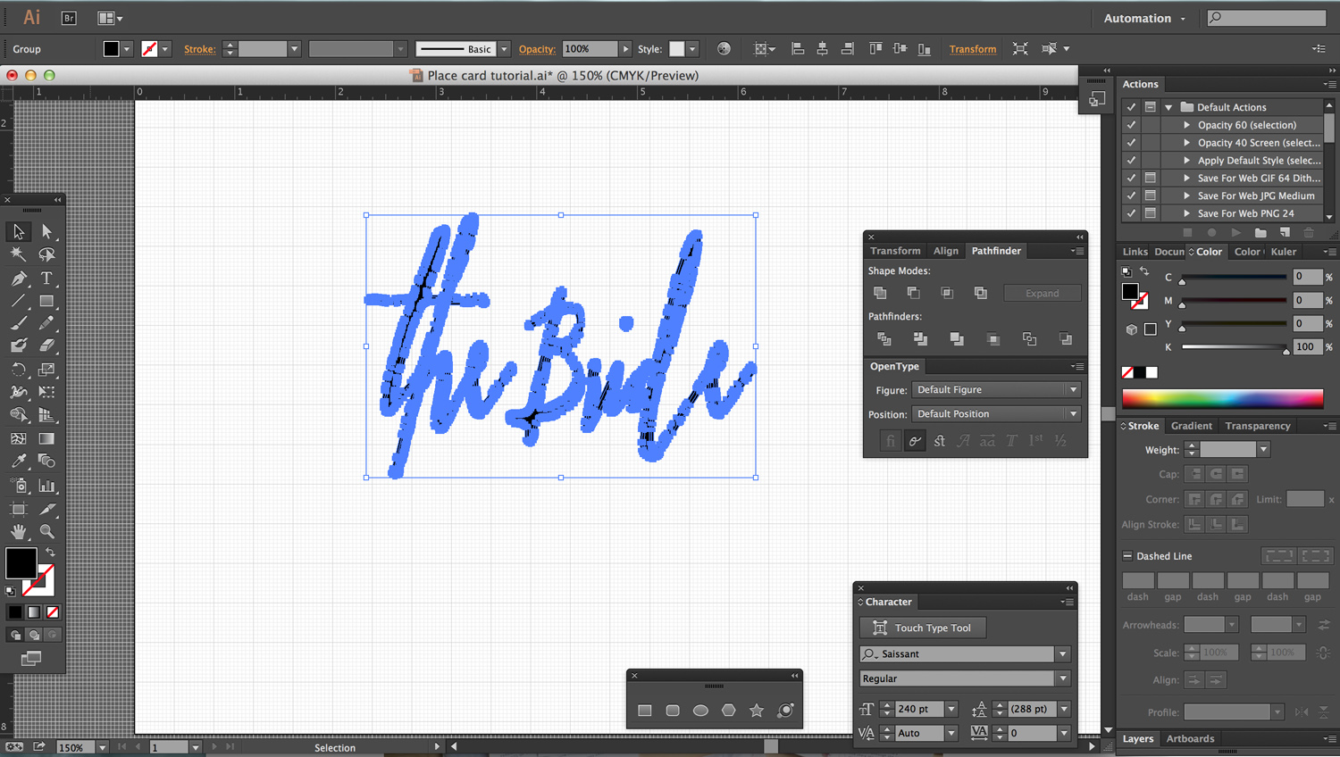 Second expansion. Now everything is fully expanded.
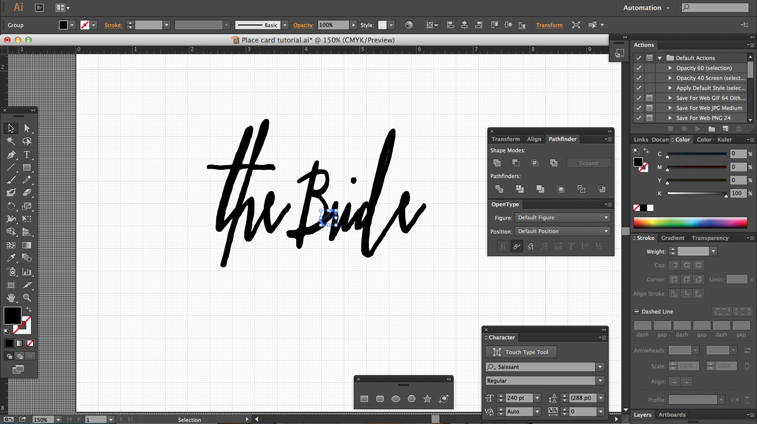
4. Create/modify any connecting details and expand. Some letters will not connect, depending on your chosen font. If you want your finished item to be a single piece, you need to edit your design to connect them- in the case of “the Bride,” I needed to connect the B to the R and move the dot of the i down. I simply drew a line to connect the letters and expanded it, and then selected the dot of the i and dragged it down to meet the rest of the text.
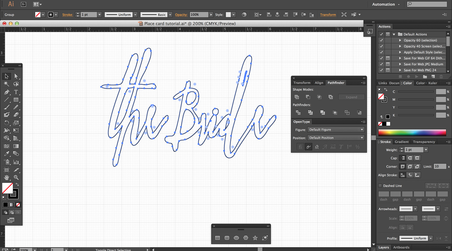
5. Combine. Use the unite tool under Pathfinder to combine all your details- your expanded paths, your modified details, etc- into a single object.
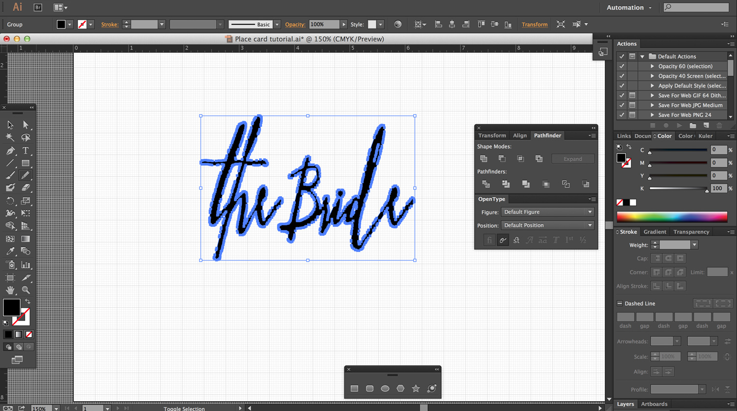
6. Simplify path. The thing that makes calligraphy fonts so beautiful- their hand-drawn quality- also makes them a big pain in the ass for letterform projects. Some fonts, like Great Lakes’ Asterism, have a simplified version without all the tiny little jagged edges of an ink-drawn font. Saissant, to the best of my knowledge, does not- so in comes the “twisty pencil,” as my friend Julie calls it. It’s also known as the Simplify Tool- basically, you drag it over your super complicated paths and it reduces the number of points. You end up with a nice, smooth, easily laserable path.
 Using the Twisty Pencil to smooth out those lines.
7. Convert to outline. The last step, which is optional, is to change your fill to a 1 pt stroke, so you can see the path the laser will follow. This will allow you to catch any weird mistakes or uncombined items before you cut it.
Now, the only thing left to do is either send this file to a laser cutting establishment or cut it on your own.
I cut mine from 1/8″ plywood scraps, but you can use anything- paper or acrylic would be cool, too. After cutting, I dunked them in gray aniline dye and added- what else?- some goddamn copper leaf.
I know, big surprise.
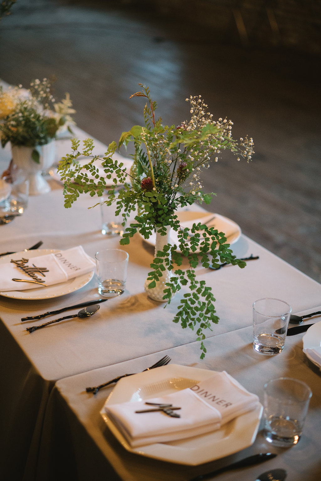 Photo by 5 West Studios.
I used the same font and concept to make an Arrested Development-themed cake topper, except this time, had my sister cover it in copper glitter:
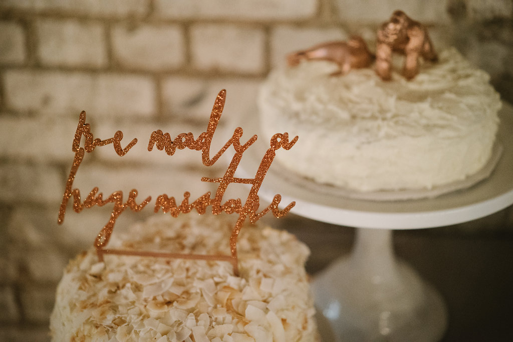 Some people probably think we’re just real cynical. But we’re actually just Gob super-fans. Photo by 5 West Studios.
*I’ve lately been asked where one can gain access to a laser cutter. Luckily, they are not very hard to find- in most cities, your best bet will be to check out your local makerspace- frequently, you can take a certification class to laser cut your own items with their machines, or they’ll simply provide the whole service for you.

Aunt Chris turned all of their name plates into refrigerator magnets. I doubt she will ever part with them.
Love that idea!! I should have put magnets on ALL of them and made them favors! Good thinking, Chris!
I stumbled here after placing the words veiled threat into google after mentioning exact words to — to this, sorry .. girl that I just bought a ring for. So, due to the alignment of the stars and all I’m leaving a comment to celebrate lovers, tenderness, beauty, frustration, bipolar tendencies and lost people, bar stools, good and bad feelings, drunks, butterflies, new cars, old cars, people who go both ways (damn them), those that came before us, and your wedding vows. Congratulations you two, may you live long and prosper.