Get With The Program
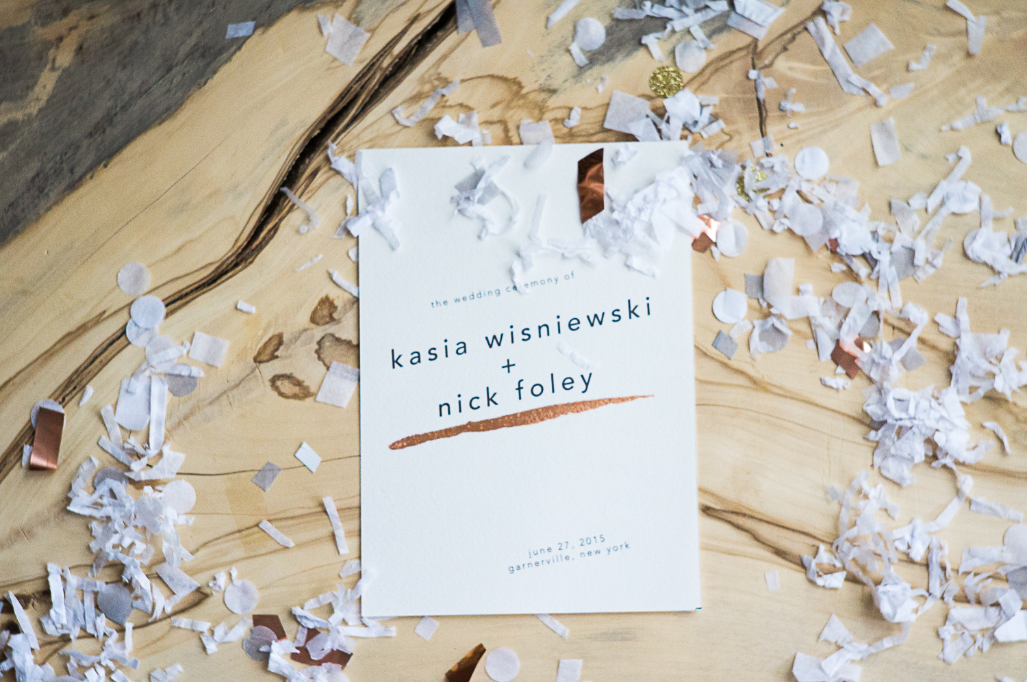
Today, I continue my haphazard coverage of the Wisniewleyweds wedding with a little show-and-tell of our ceremony paper goods.
I’m not a graphic designer (graphic designers reading this are like, “yeah, obviously.”). I have mad respect for graphic designers and their vast knowledge of typefaces, kerning, and other areas with very specific vocabulary us laypeople are not privy to. But I love paper and cards and notebooks and invitations, and I’ve had a really fun time experimenting in this arena over the past year (here and here).
There’s a convention that your paper goods for your whole wedding extravaganza- from invitations to thank you cards- should match. Save-the-dates get a free pass to be different and weird- but the concept of the “suite” still holds on strong.
This is BS, in my opinion. As far as I know- so I can’t know FOR SURE- I don’t think any of our guests brought our invitation to the wedding to compare typography or motifs or color stories. All of our shit was 100% different. It was more fun that way, and I was able to reflect my rapidly-changing tastes in real time. What I was feeling in October is not what I was feeling in February, which, in turn, was not what I was feeling in June.
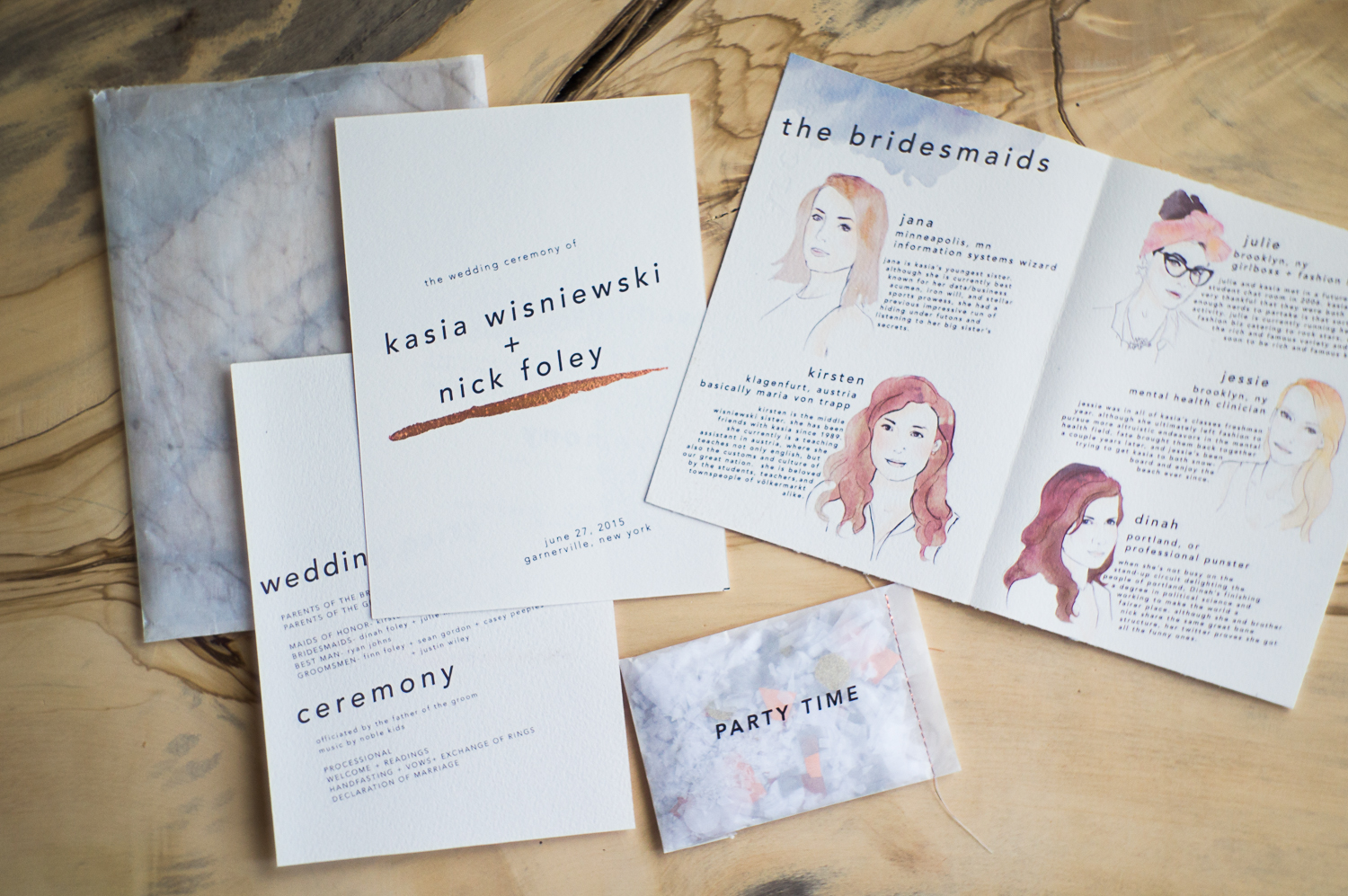
So when our guests arrived at their seat for the ceremony, this is what greeted them:
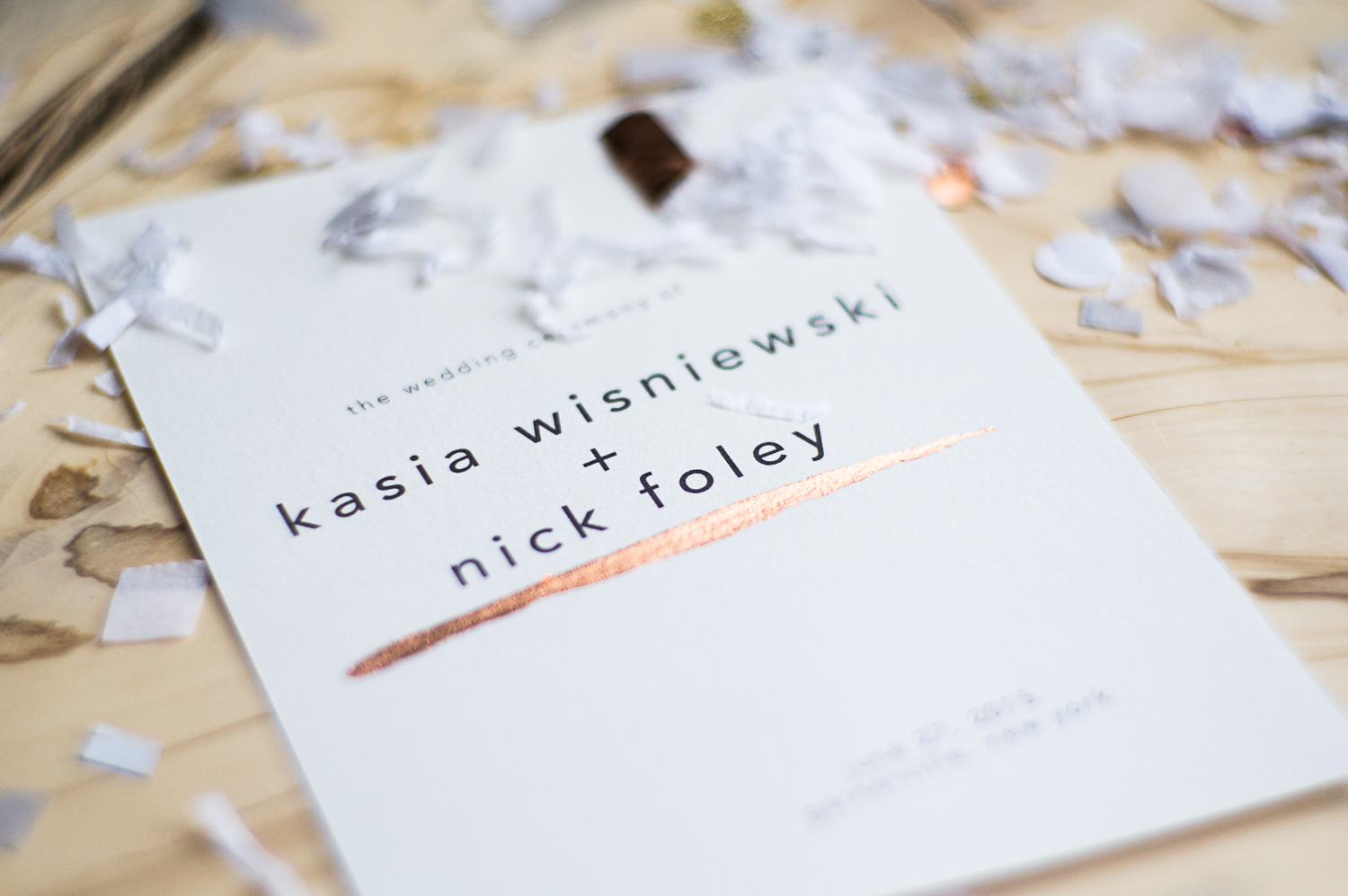
There was a 5×7 glassine envelope that I printed with a marble print in the same method as the confetti packets. Inside was the program- pretty bare-bones, but with a brushstroke of copper leaf (I’ll get to that in a minute). There was an illustrated “Meet the Bridesmaids” thing. There was the aforementioned confetti packet. The notebooks and pencils were in there, too.
Everything was printed at home on a 300gsm watercolor paper that we got at New York Central. It was during the cutting of this paper, incidentally, that the Great Leg Stabbing of 2015 took place- see, at New York Central, you generally buy large sheets of a given paper and have to cut them down to size. It took like a million years and ended my leg modeling career, so I don’t know that I would recommend that route. If you can find paper that fits into a printer without cutting, definitely do that.
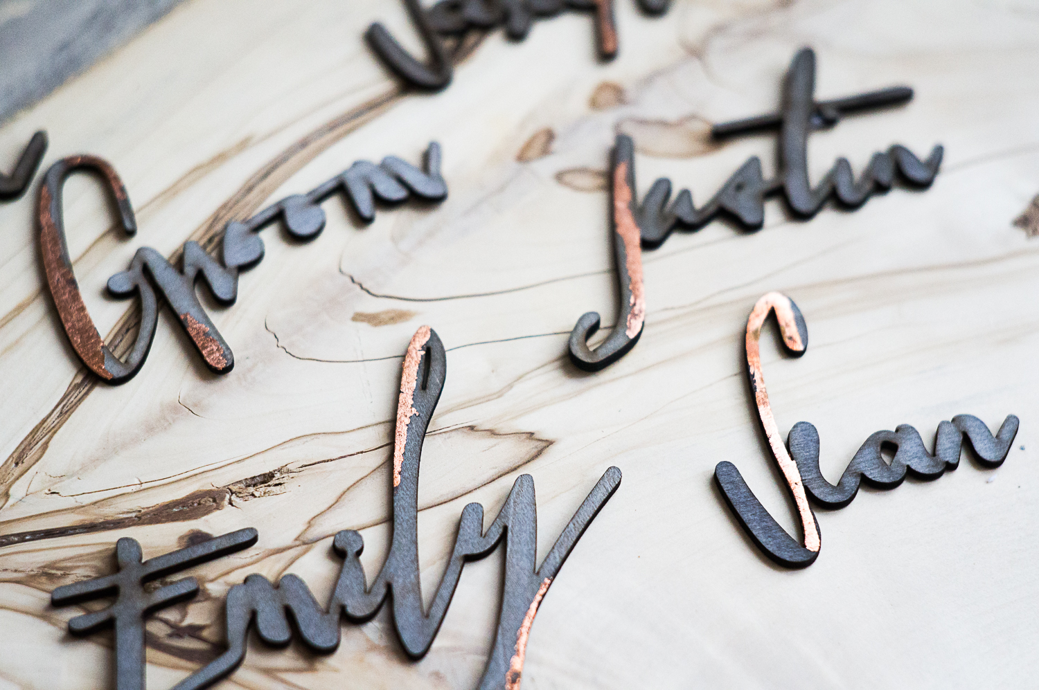
Of course, it wouldn’t be one of my DIYs without having SOME element that you can force your friends and/or family to do and cause them to resent you forever. In this case, it was the copper-gilding part. In theory, it’s simple- just use a brush to add a stroke of sizing to the paper, allow to dry slightly, and add your copper leaf, just like any other leafing project. I made my sisters do it, and I was a real tool, chastising them for making their strokes too thick OR too thin, too high or too low. Ugh, why am I like that?
But, they turned out GREAT!
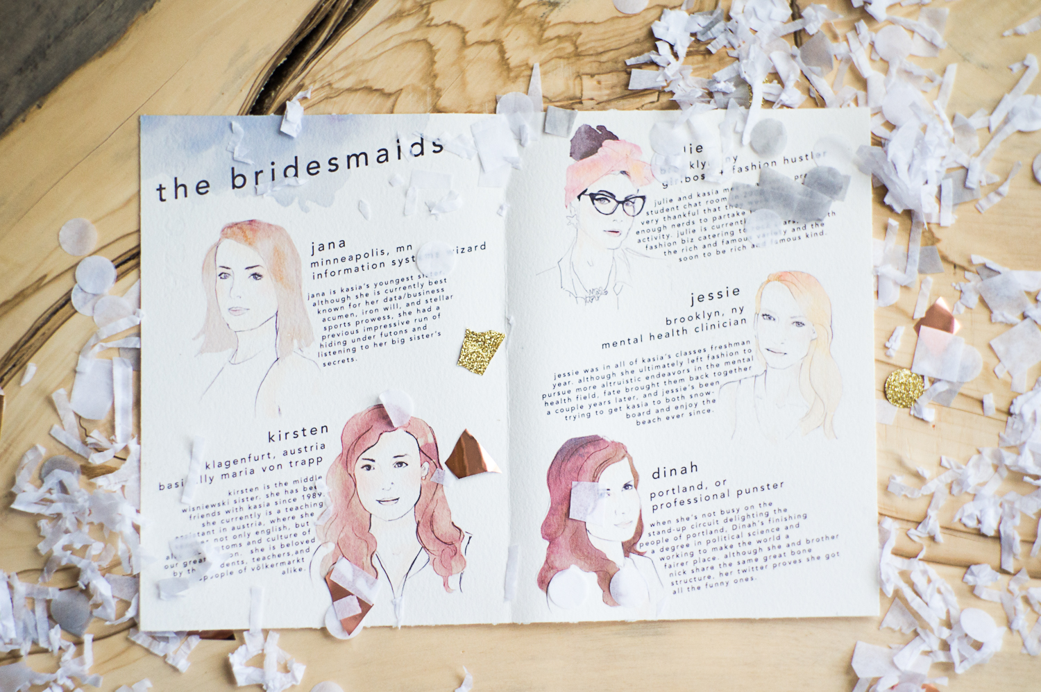
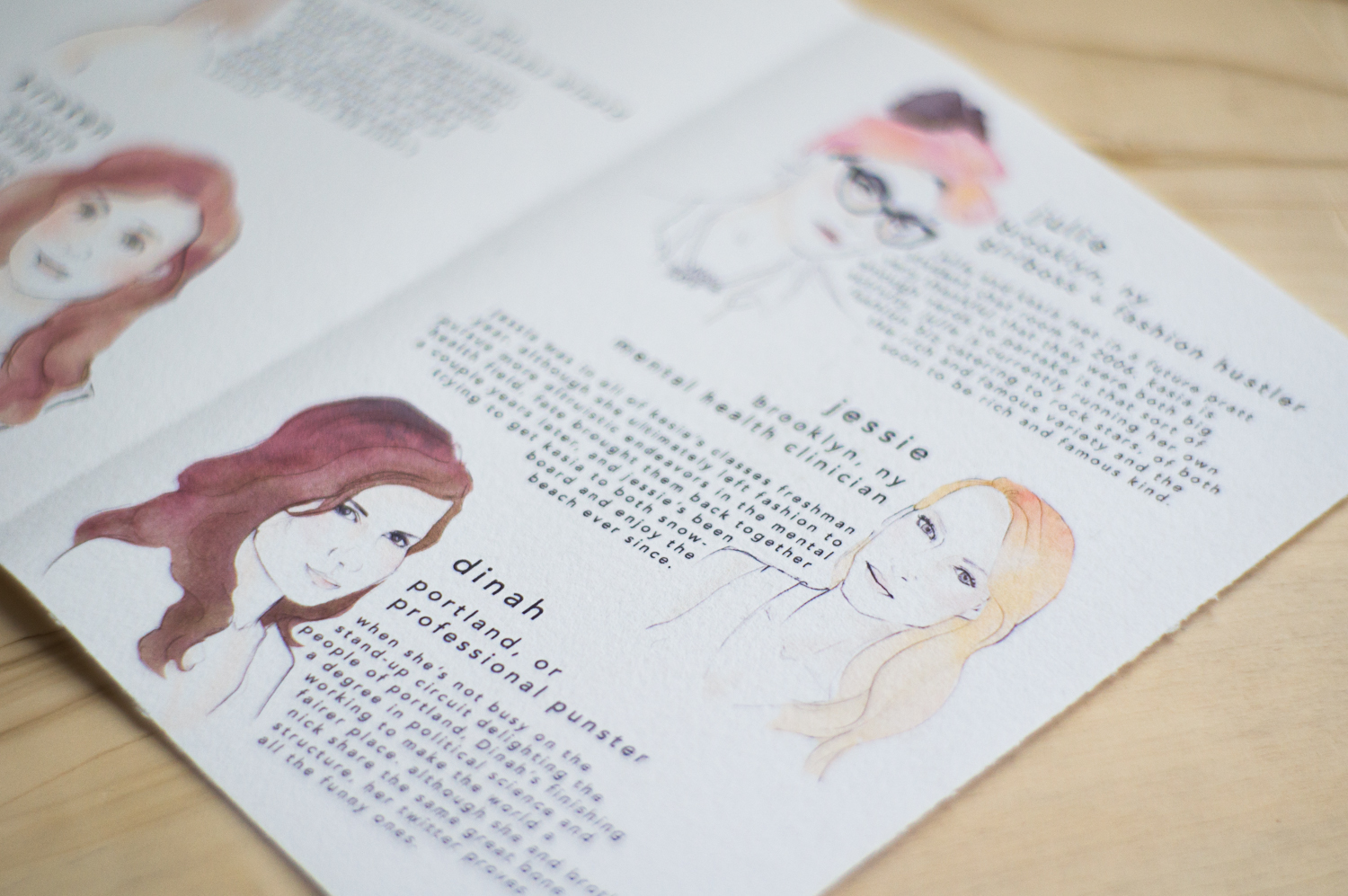
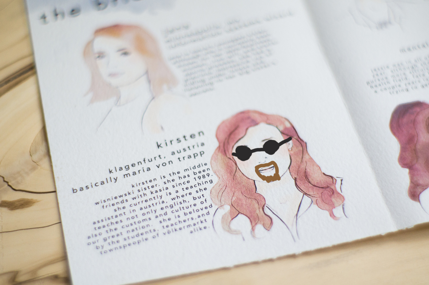
The second part of the suite was the bridesmaids information page, with little watercolor illustrations by yours truly. I came up with little silly bios and job titles for all of them (except Jessie, because when I was trying to come up with a cute but not-offensive title for her job, I used her REAL job as a place-holder, and then forgot to change it. So Mental Health Clinician seems a little out of place when compared to “Professional Punster” and “Basically Maria Von Trapp”).
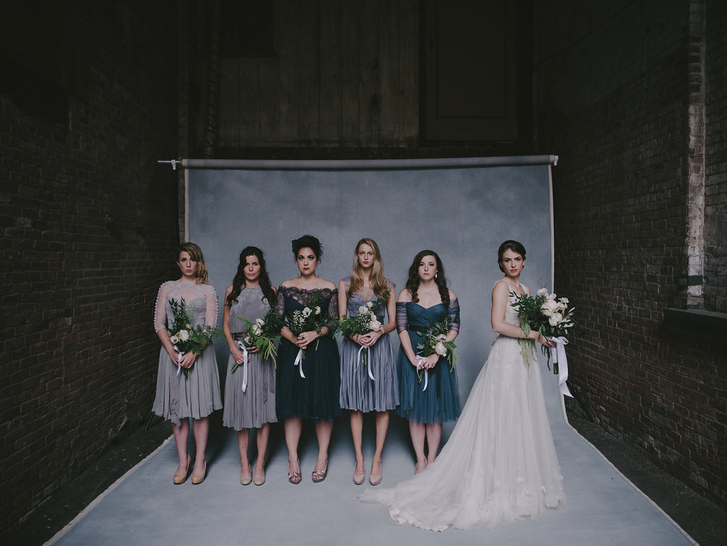 Can you match the illustrated bridesmaid to the real-life bridesmaid?
Now, you, like many of our guests, may notice that there are no drawings of the groomsmen. There are a couple reasons for this:
1. The Cruel March of Time. When I first came up with the idea of doing little illustrations of the bridal party in early June (AKA crunch time), I planned to draw all 10 members. I started with the bridesmaids, because I like them more (no offense, guys). I drew them and then didn’t want to do any more.
2. Boys are hard to draw. I have a bad track record of drawing men. I like a blushed cheek and beautiful eyelashes a little too much and literally just cannot control myself. Even as a kid, I drew all my male paper dolls with sunglasses and David Blaine-esque goatees because 1. I needed to cover up the foot-long eyelashes that I already drew in pen and 2. facial hair has been and always will be sexy.
3. Grooms are procrastinators. After I decided I didn’t want to attempt to draw all these dudes, I told Nick he had to come up with a cool idea of his own to represent his side of things. And, to be fair, he did. He used the 3D scanning program 123D Catch to make 3D models of two of his friends. They turned out sick- but they took a longggg time. And with one groomsmen coming two days before the wedding and one coming the morning OF the wedding, this just wasn’t going to fly. And so the project was abandoned on Wednesday the week of the wedding. Whoops.
So if you’re interested in DIYing your ceremony paper goods, go for it! I have a couple tips for you:
1. If you’re unskilled in graphic design, find some inspirational pieces on the interwebs and try to copy them. As you work, you’ll start making changes without even realizing it- and soon, you’ll have an entirely original design. That’s what I did- my inspirational images bear only the the most basic resemblance to the finished product. Having a guide to get you started, though, rather than just staring at a blank page, is invaluable.
2. Put the copy paper down and slowly back away. Instead, pick papers with texture or different transparencies- it elevates your home-printed design and makes it look like something you might have paid money for.
3. Add one or two special details. The copper swipe really stepped the program up a notch. Even though it was a little time-consuming, it was, in the scheme of things, no match for the pop-up fiasco of the invitations or the etched acrylic Save the Dates. It helps when you have wedding slaves- err, sisters- to do it for you. But a little touch like that can really take it from “She made these at home” to “She made these at home???!?”.
4. Give your guests something to read. People like to know who the people standing up at the front are. They like to know if you’re doing some wacky ceremonial thing. It gives a little context and makes the whole thing a little more meaningful.
5. Have fun with it. Don’t worry too much if the paper isn’t quite the right shade of white to match your linens or if you used a serif font on your invites and a sans serif on the programs. No one cares. Really.
One thing I learned from wedding planning is that the end result is really only part of the equation. If you can enjoy your DIYs and the process, preferably while having some laughs with your betrothed or your family or your friends, and also preferably accompanied by pizza and/or a beer or two, that’s ultimately what is important. If the finished result is beautiful and exactly what you imagined, that’s just icing on the cake. Or gold leaf on the program.

