
Please Come To My Party
So we’ve officially invited people to this thing. We’ve told them the time and address and everything, so we’re going to have to be ready.
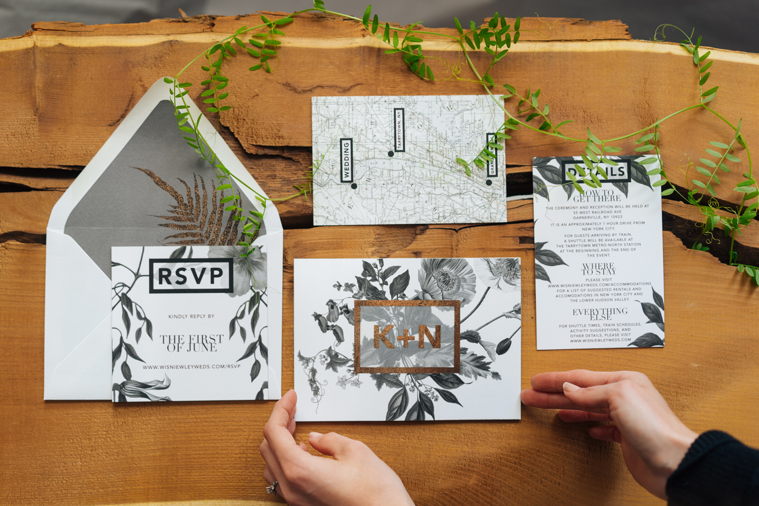
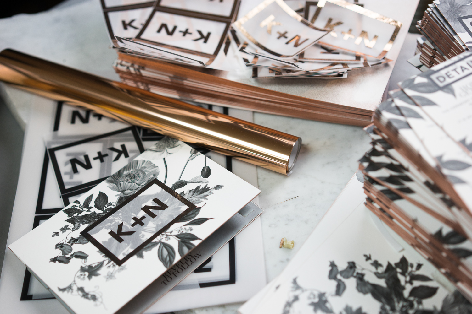
Our invitations were quite the labor of love, and despite our best intentions, did end up being quite… time consuming. I think at this point, it’s safe to assume that, despite a pretty good amount of experience in creative projects and handcraft, I really have no idea how long things take.
So, I’m going to be conducting yearly inspections at our guests’ homes to make sure they never throw them out. At least for the first 25 years.
I could share a million pictures of our protos and write way too many words about every step and element, but that would be boring. Instead, I’ll just highlight a few key details and resources that might prove helpful to other invitation DIY-ers.
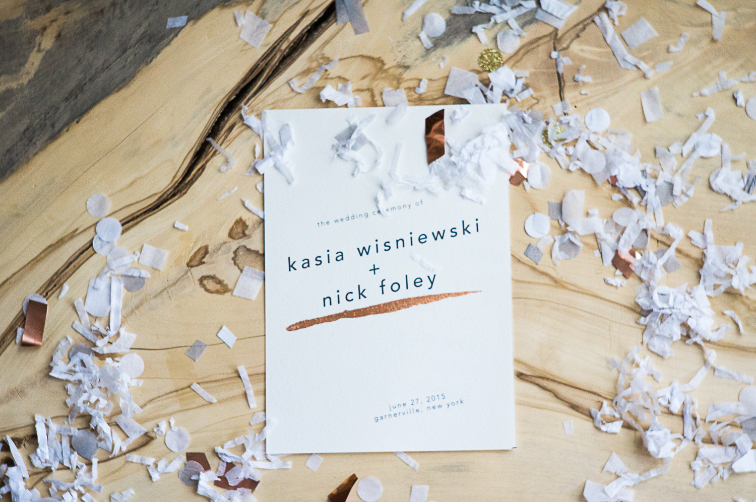
1. Botanical illustrations are easy to find all over the internet, but my favorite source for large, high-quality images is the aptly named www.plantillustrations.org. You can search by artist (my personal go-to is G.F. Muller von Ruffach), publication, or scientific and vernacular names. As with all images, be cool about how you use them, guys- although these are public domain, the original contributing sites sometimes have further stipulations about use.
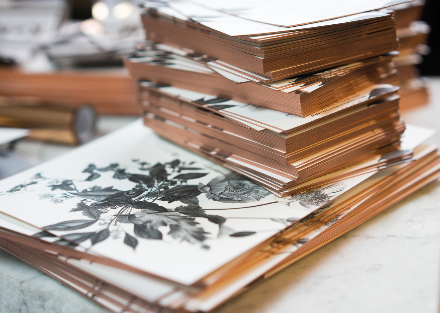
2. We once again used Thikit’s fine services for our ultra-thick printing needs. I can’t get enough of that super-heavy stock.

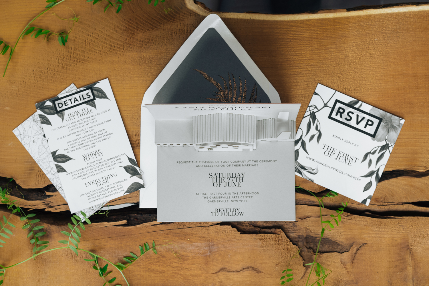
3. A couple techniques here might look familiar- we once again did our own metallic edge-painting (see our Save the Date post for the incredibly obvious instructions). The 7×10″ sheet that composed our main card’s cover was a little unwieldy and hard to keep from bowing, even with clamps- so I recommend DIY edge painting for 5×7″ and smaller cards only.
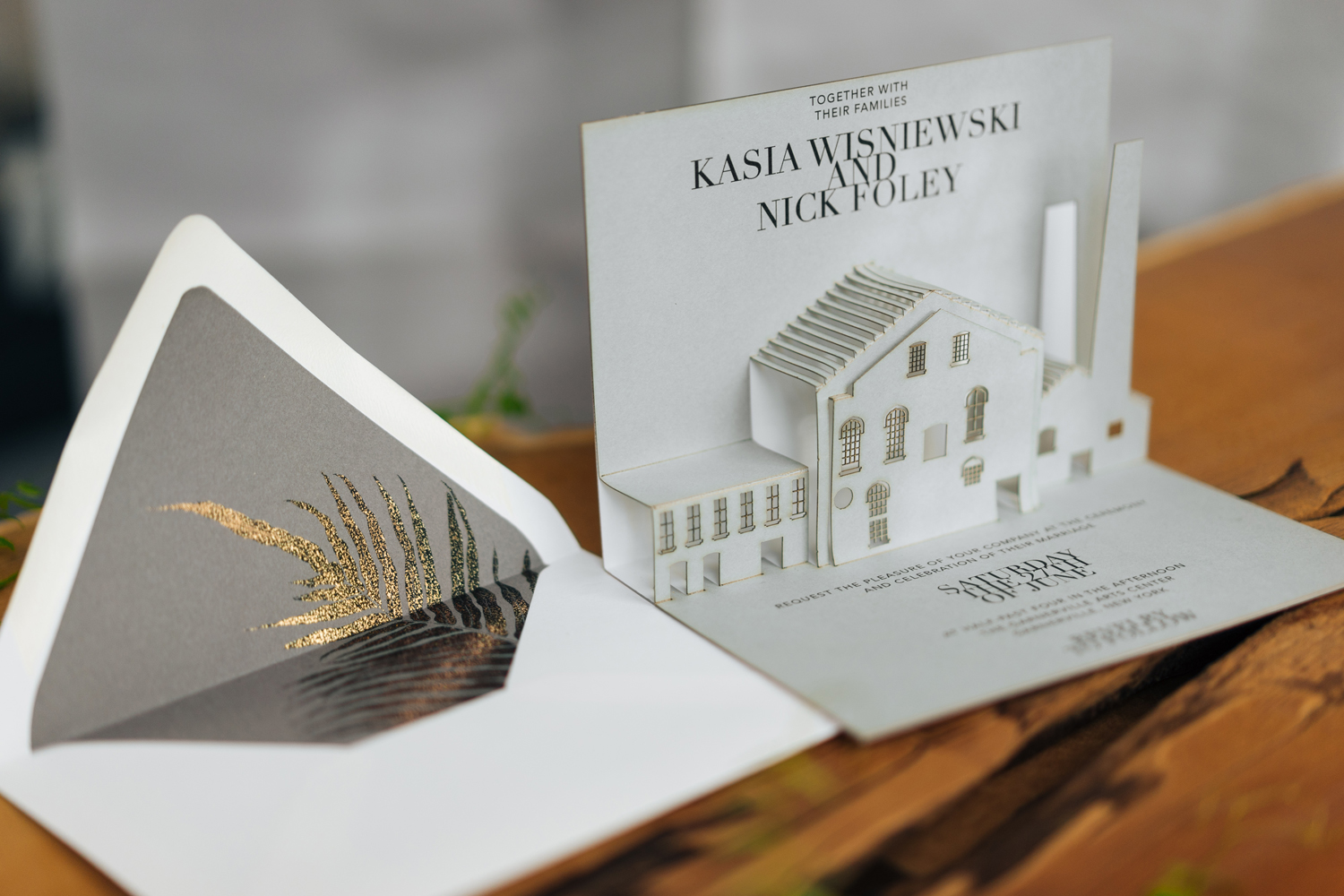
I also finally got to bust out that laminator– for this purpose, I actually preferred the weathered effect of a not-fully foiled surface (“Sure you did,” you’re probably thinking to yourself. But that’s my story and I’m sticking to it), so we (my sister) ran each vellum piece through the crappy laminator twice. Same goes for the metallic fern envelope liner. The most annoying part of this process was taping the foiled pieces to the invitations- the actual foiling is easy and can be done easily while binge-watching reality TV or Empire.
PS- liners are so god**** easy to make. I’ll share how I made my template in an upcoming post, but you could also probably figure it out on your own with an extra 5 minutes.
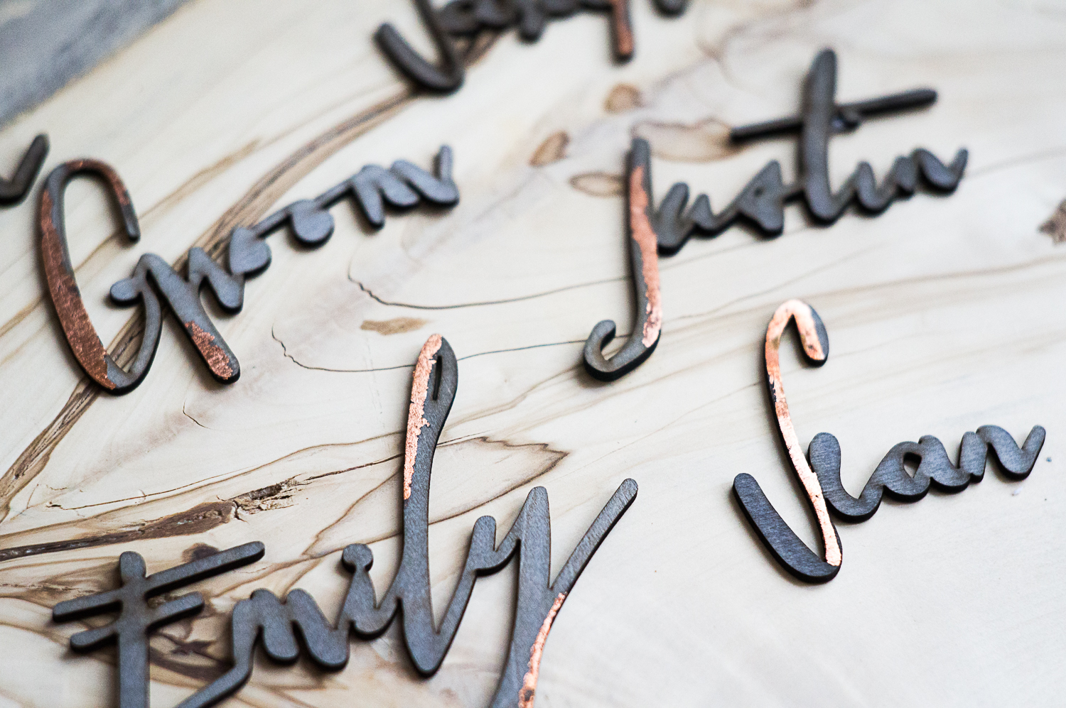
4. We (and by we, I mean Nick) generated the pop-up artwork using SolidWorks, and then we laser cut them and painstakingly folded each one. Even with etched folding lines, this was a real pain in the you-know-what. We messed a bunch of them up, but justified it by insisting the dilapidation added to the realism of a 19th century factory.
5. I really like the envelopes from Cards and Pockets, guys. They are way cheaper than the Euro-flap envelopes from Paper Source, and they come in about a million colors. The only issue I faced is that when I ordered samples, they came unlabeled. So I had three white envelopes- Snow White, Ice White, and White Frost- but didn’t know which envelope corresponded to which color. And they all had snow-related names. I had to get into some pretty deep color psychology to figure it out, but I did manage to guess the right name and order the right envelopes (Snow White, by the way).
So there you have it. For my next wedding, I’m just going to send an email.


3 comments